Hi, I'm Ash Ngu.
I currently build data visualization tools at Netflix. Before that, I made data-driven stories and web apps for ProPublica and The New York Times.
Check out my selected work, photography and woodwork.
Selected Work
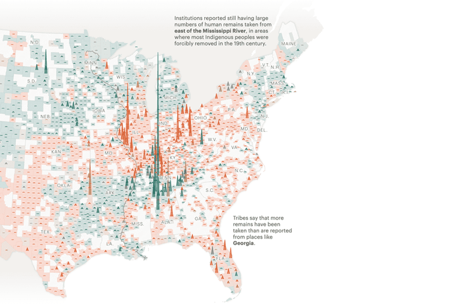
![Tracking The Repatriation of Native American Remains Under NAGPRA]() Tracking The Repatriation of Native American Remains Under NAGPRABuilt a web application showing which institutions still have ancestral remains. Used by 70+ newsrooms to further report on delayed repatriation.Pitch • Reporting • Design • Development • Data Collection • Data Analysis • Data Visualization • Writing
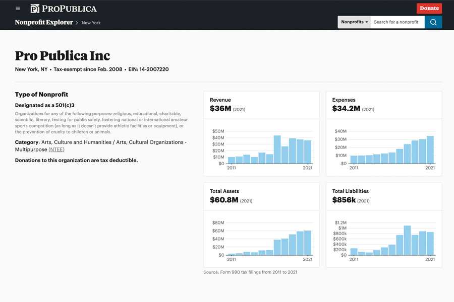
Tracking The Repatriation of Native American Remains Under NAGPRABuilt a web application showing which institutions still have ancestral remains. Used by 70+ newsrooms to further report on delayed repatriation.Pitch • Reporting • Design • Development • Data Collection • Data Analysis • Data Visualization • Writing![Nonprofit Explorer]() Nonprofit ExplorerBuilt key pages and a chart component for a nonprofit financial data tool widely used by journalists, donors, and researchers.Design • Development • Data Visualization
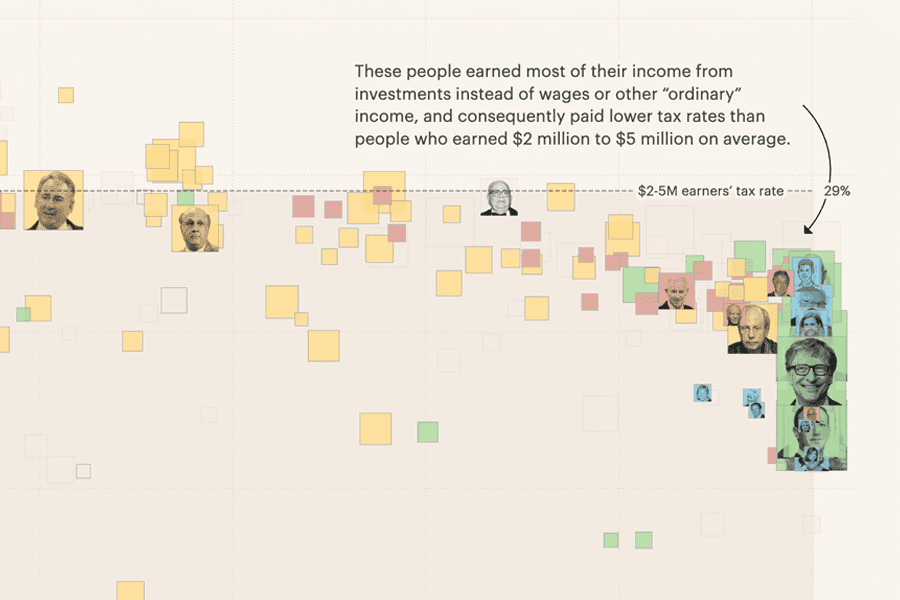
Nonprofit ExplorerBuilt key pages and a chart component for a nonprofit financial data tool widely used by journalists, donors, and researchers.Design • Development • Data Visualization![America’s Highest Earners And Their Taxes]() America’s Highest Earners And Their TaxesWorked closely with business reporters to turn raw tax data into a visual walkthrough explaining how the highest earning Americans are taxed.Design • Development • Data Visualization • Writing
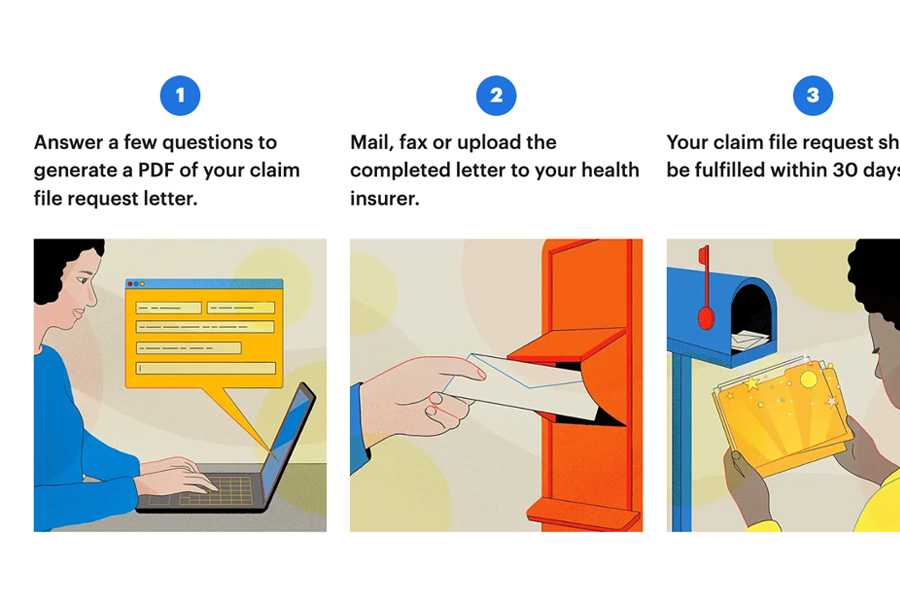
America’s Highest Earners And Their TaxesWorked closely with business reporters to turn raw tax data into a visual walkthrough explaining how the highest earning Americans are taxed.Design • Development • Data Visualization • Writing![Claim File Helper]() Claim File HelperBuilt a tool that helps patients request information from their insurers to find out why their claim was denied.Design • Development • Writing • Art Direction
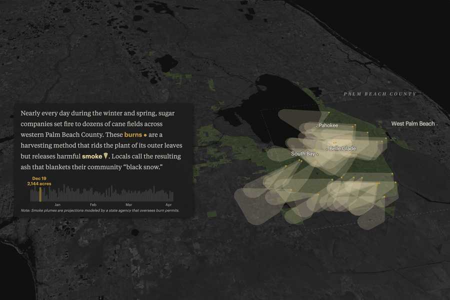
Claim File HelperBuilt a tool that helps patients request information from their insurers to find out why their claim was denied.Design • Development • Writing • Art Direction![The Smoke Comes Every Year. Sugar Companies Say the Air Is Safe.]() The Smoke Comes Every Year. Sugar Companies Say the Air Is Safe.Published an explainer visualizing the impact of cane sugar burns in Florida using data we collected using real-time air monitors.Design • Development • Data Collection • Data Analysis • Data Visualization • Writing
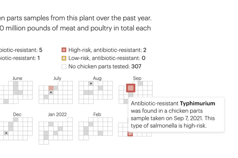
The Smoke Comes Every Year. Sugar Companies Say the Air Is Safe.Published an explainer visualizing the impact of cane sugar burns in Florida using data we collected using real-time air monitors.Design • Development • Data Collection • Data Analysis • Data Visualization • Writing![Chicken Checker]() Chicken CheckerBuilt a grocery shopping tool that helps people see how often salmonella was found at their poultry processor.Design • Development • Data Visualization
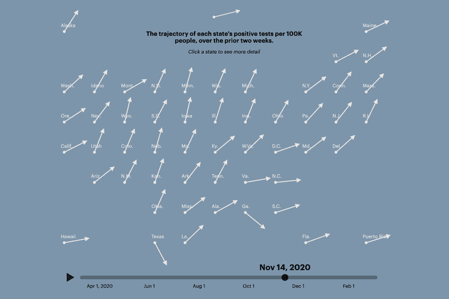
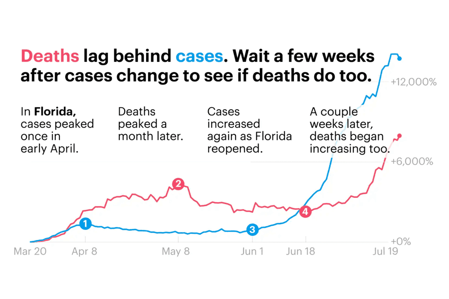
Chicken CheckerBuilt a grocery shopping tool that helps people see how often salmonella was found at their poultry processor.Design • Development • Data Visualization![States Are Reopening: See How Coronavirus Cases Rise or Fall]() States Are Reopening: See How Coronavirus Cases Rise or FallBuilt a dashboard visualizing states' COVID trajectories and whether states were meeting reopening guidelines.Design • Development • Data Visualization
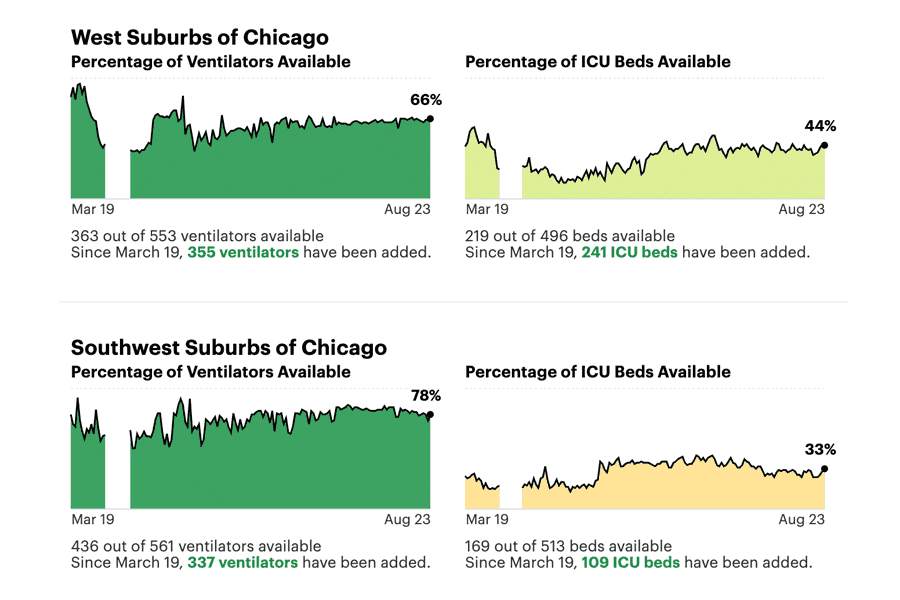
States Are Reopening: See How Coronavirus Cases Rise or FallBuilt a dashboard visualizing states' COVID trajectories and whether states were meeting reopening guidelines.Design • Development • Data Visualization![Tracking Hospital Utilization in Illinois At The Start of The Pandemic]() Tracking Hospital Utilization in Illinois At The Start of The PandemicBuilt a hospital utilization tracker months before the Illinois Department of Public Health published their own.Design • Development • Data Visualization
Tracking Hospital Utilization in Illinois At The Start of The PandemicBuilt a hospital utilization tracker months before the Illinois Department of Public Health published their own.Design • Development • Data Visualization![How to Understand COVID-19 Numbers]() How to Understand COVID-19 NumbersDesigned a quick series of cards to help readers develop COVID data literacy.Design • Data Visualization
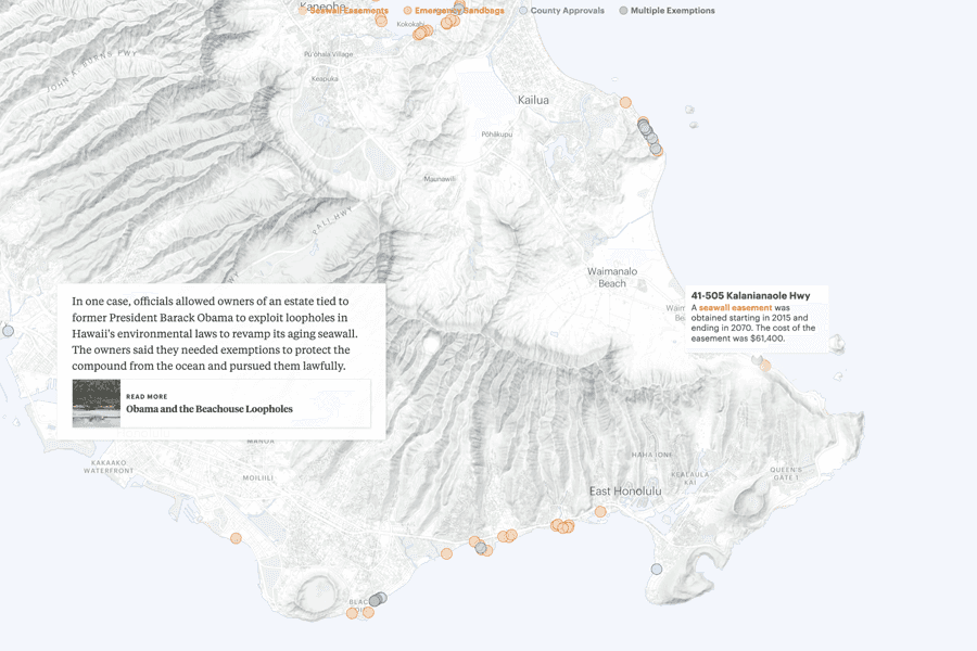
How to Understand COVID-19 NumbersDesigned a quick series of cards to help readers develop COVID data literacy.Design • Data Visualization![Hawaii's Beaches Are Disappearing]() Hawaii's Beaches Are DisappearingProduced a visual explainer of beach damage from seawalls in Hawaii using public records data.Design • Development • Data Visualization • Writing • Drone Videography
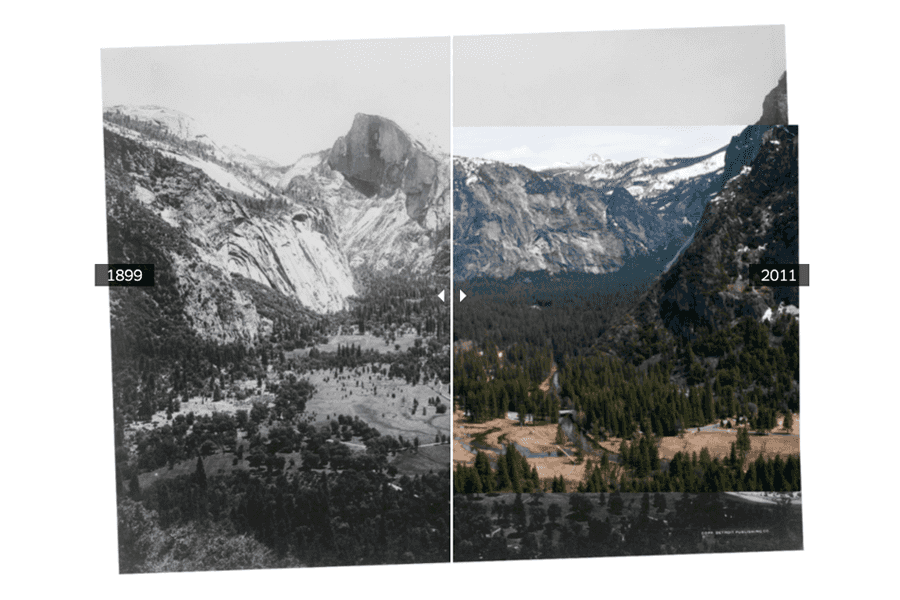
Hawaii's Beaches Are DisappearingProduced a visual explainer of beach damage from seawalls in Hawaii using public records data.Design • Development • Data Visualization • Writing • Drone Videography![Opinion | To Help Prevent the Next Big Wildfire, Let the Forest Burn]() Opinion | To Help Prevent the Next Big Wildfire, Let the Forest BurnPitched and produced a timely visual op-ed using data to present the case for prescribed burns.Pitch • Reporting • Writing • Design • Data Visualization
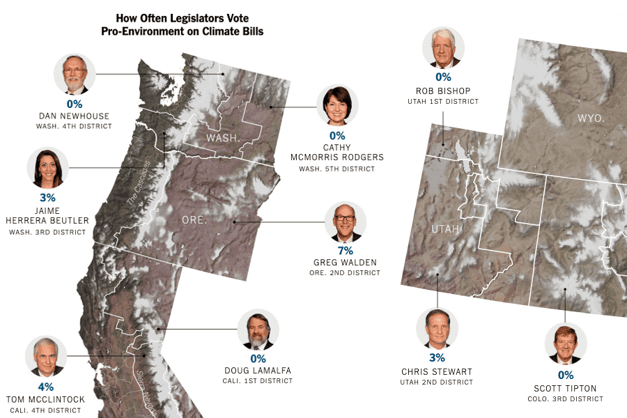
Opinion | To Help Prevent the Next Big Wildfire, Let the Forest BurnPitched and produced a timely visual op-ed using data to present the case for prescribed burns.Pitch • Reporting • Writing • Design • Data Visualization![Opinion | Why Can’t Rich People Save Winter?]() Opinion | Why Can’t Rich People Save Winter?Used mapping and legislative data to show how politicians in ski states aren’t doing enough to stop climate change and save the snowpack.Reporting • Data Visualization
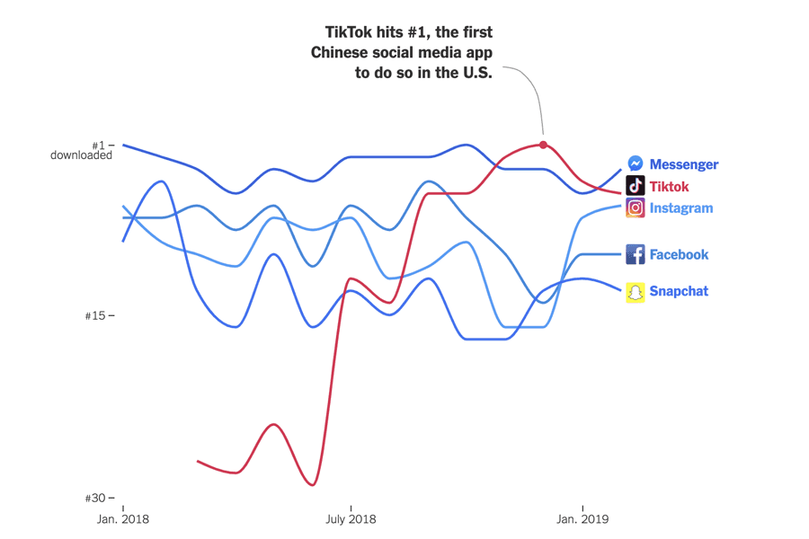
Opinion | Why Can’t Rich People Save Winter?Used mapping and legislative data to show how politicians in ski states aren’t doing enough to stop climate change and save the snowpack.Reporting • Data Visualization![Opinion | We Should Worry About How China Uses Apps Like TikTok]() Opinion | We Should Worry About How China Uses Apps Like TikTokVisualized app data foreshadowing concerns over the increased popularity of TikTok in the Five Eyes countries.Design • Data Visualization
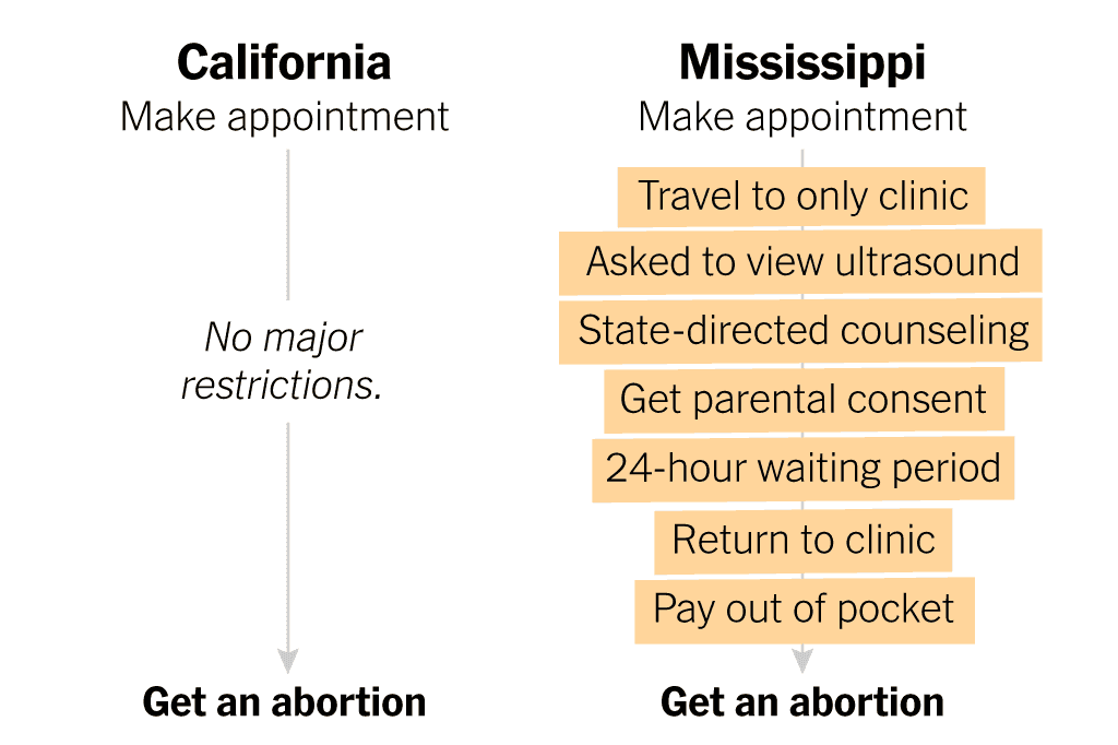
Opinion | We Should Worry About How China Uses Apps Like TikTokVisualized app data foreshadowing concerns over the increased popularity of TikTok in the Five Eyes countries.Design • Data Visualization![What It Takes to Get an Abortion in the Most Restrictive U.S. State]() What It Takes to Get an Abortion in the Most Restrictive U.S. StateProduced a visual comparison of how to get an abortion in two states to highlight disparities in abortion access.Reporting • Design • Development
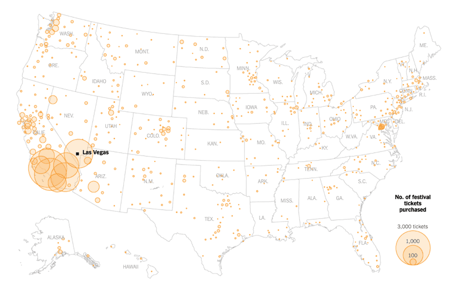
What It Takes to Get an Abortion in the Most Restrictive U.S. StateProduced a visual comparison of how to get an abortion in two states to highlight disparities in abortion access.Reporting • Design • Development![After the Las Vegas Shooting, the Nation Moved On. Many Survivors Did Not.]() After the Las Vegas Shooting, the Nation Moved On. Many Survivors Did Not.Crunched Ticketmaster data to show the wide geographic spread of those affected by the shooting.Reporting • Writing • Interviewing • Data Visualization
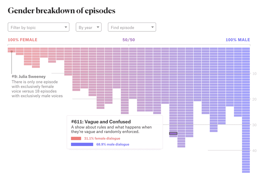
After the Las Vegas Shooting, the Nation Moved On. Many Survivors Did Not.Crunched Ticketmaster data to show the wide geographic spread of those affected by the shooting.Reporting • Writing • Interviewing • Data Visualization![Gender on This American Life]() Gender on This American LifeCollected a unique dataset and built an interactive explainer proving a gender disparity in air time on the acclaimed radio show.Pitch • Design • Development • Data Collection • Data Analysis • Data Visualization • Writing
Gender on This American LifeCollected a unique dataset and built an interactive explainer proving a gender disparity in air time on the acclaimed radio show.Pitch • Design • Development • Data Collection • Data Analysis • Data Visualization • Writing
Photography
 San Francisco, California — Danny Pham shares an intimate moment at GAMeBoi SF.Part of a 2016 series called Coming Home, which highlighted queer Asian Americans and their concepts of home.
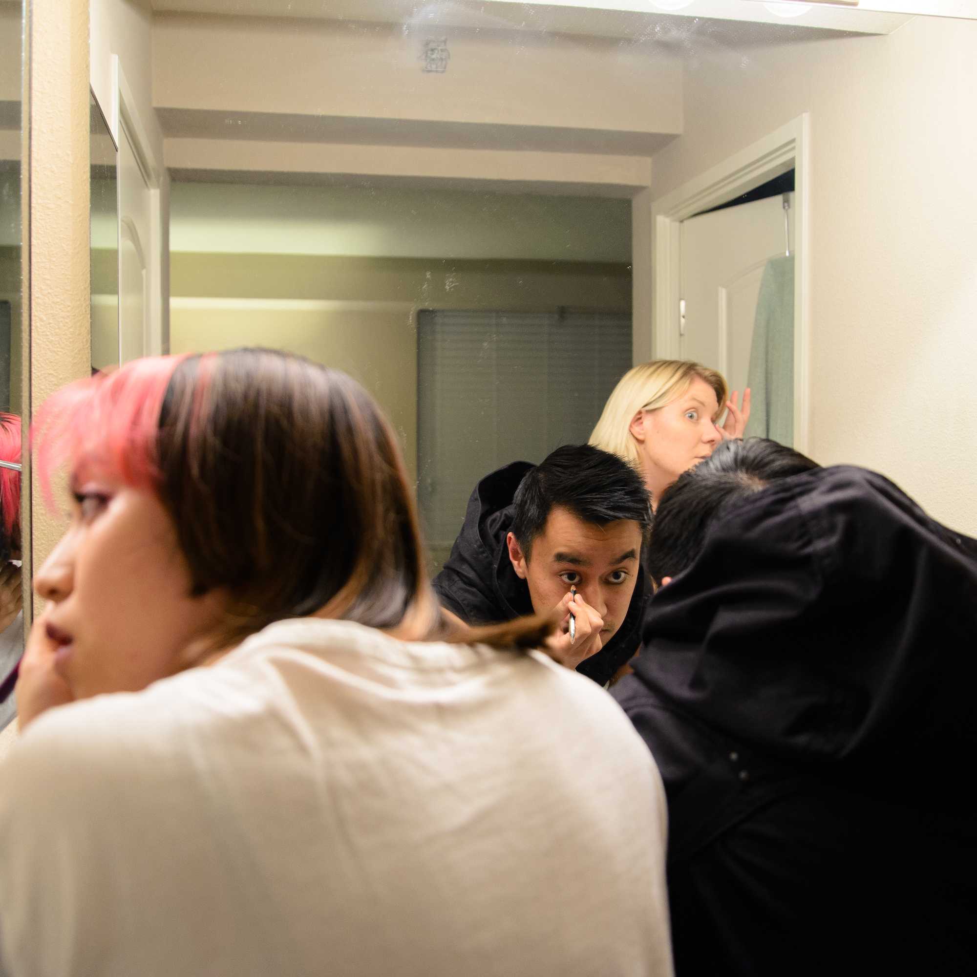
![Roy Luo gets ready for a goth party with his sister and best friend.]() San Francisco, California — Roy Luo gets ready for a goth party with his sister and best friend.Part of the Coming Home series
San Francisco, California — Roy Luo gets ready for a goth party with his sister and best friend.Part of the Coming Home series![On the anniversary of 9/11, members of the FDNY Emerald Society played bagpipes outside of O'Hara's Pub.]() Manhattan, New York — On the anniversary of 9/11, members of the FDNY Emerald Society played bagpipes outside of O'Hara's Pub.
Manhattan, New York — On the anniversary of 9/11, members of the FDNY Emerald Society played bagpipes outside of O'Hara's Pub.![An officer's head is gripped by a fellow first responder on the anniversary of 9/11.]() Manhattan, New York — An officer's head is gripped by a fellow first responder on the anniversary of 9/11.
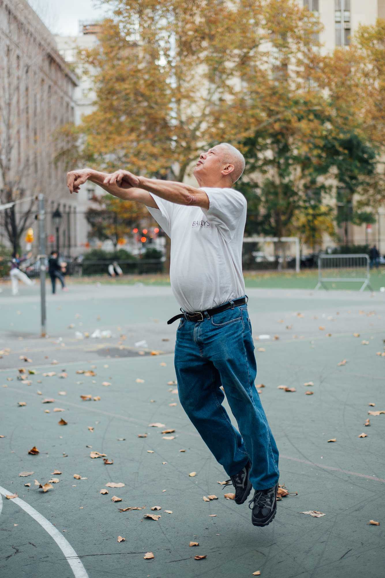
Manhattan, New York — An officer's head is gripped by a fellow first responder on the anniversary of 9/11.![Hsin Chuen-Lin demonstrates his throwing technique.]() Fremont, California — Hsin Chuen-Lin demonstrates his throwing technique.
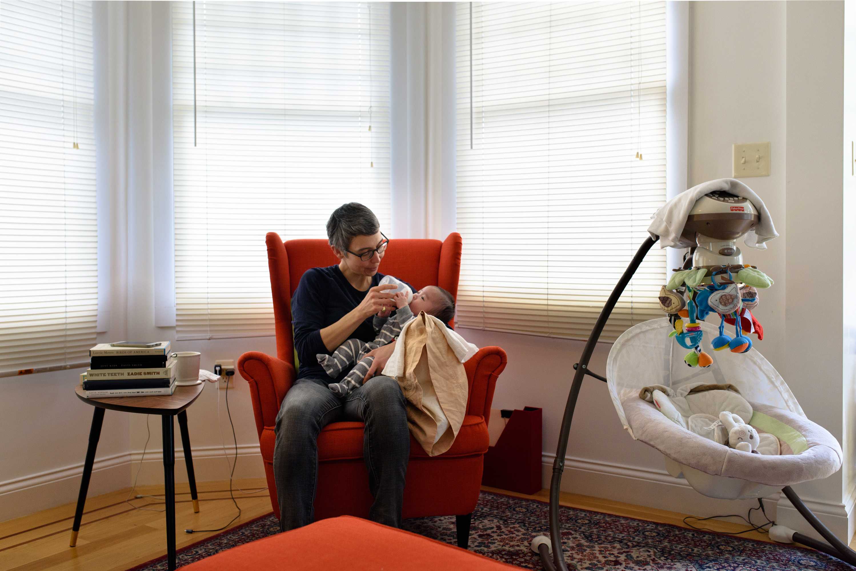
Fremont, California — Hsin Chuen-Lin demonstrates his throwing technique.![Inger Brinck feeding their four-month old son. They are considering moving out of Oakland as housing costs increase.]() Oakland, California — Inger Brinck feeding their four-month old son. They are considering moving out of Oakland as housing costs increase.Part of the Coming Home series
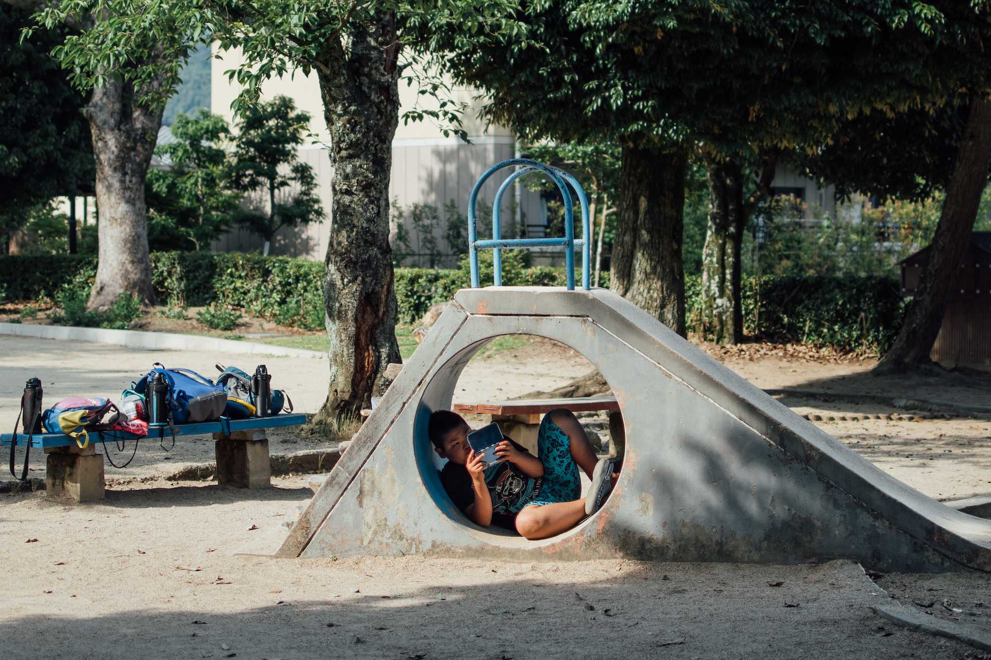
Oakland, California — Inger Brinck feeding their four-month old son. They are considering moving out of Oakland as housing costs increase.Part of the Coming Home series![A boy curls up underneath a slide to play his Nintendo DS.]() Kyoto, Japan — A boy curls up underneath a slide to play his Nintendo DS.
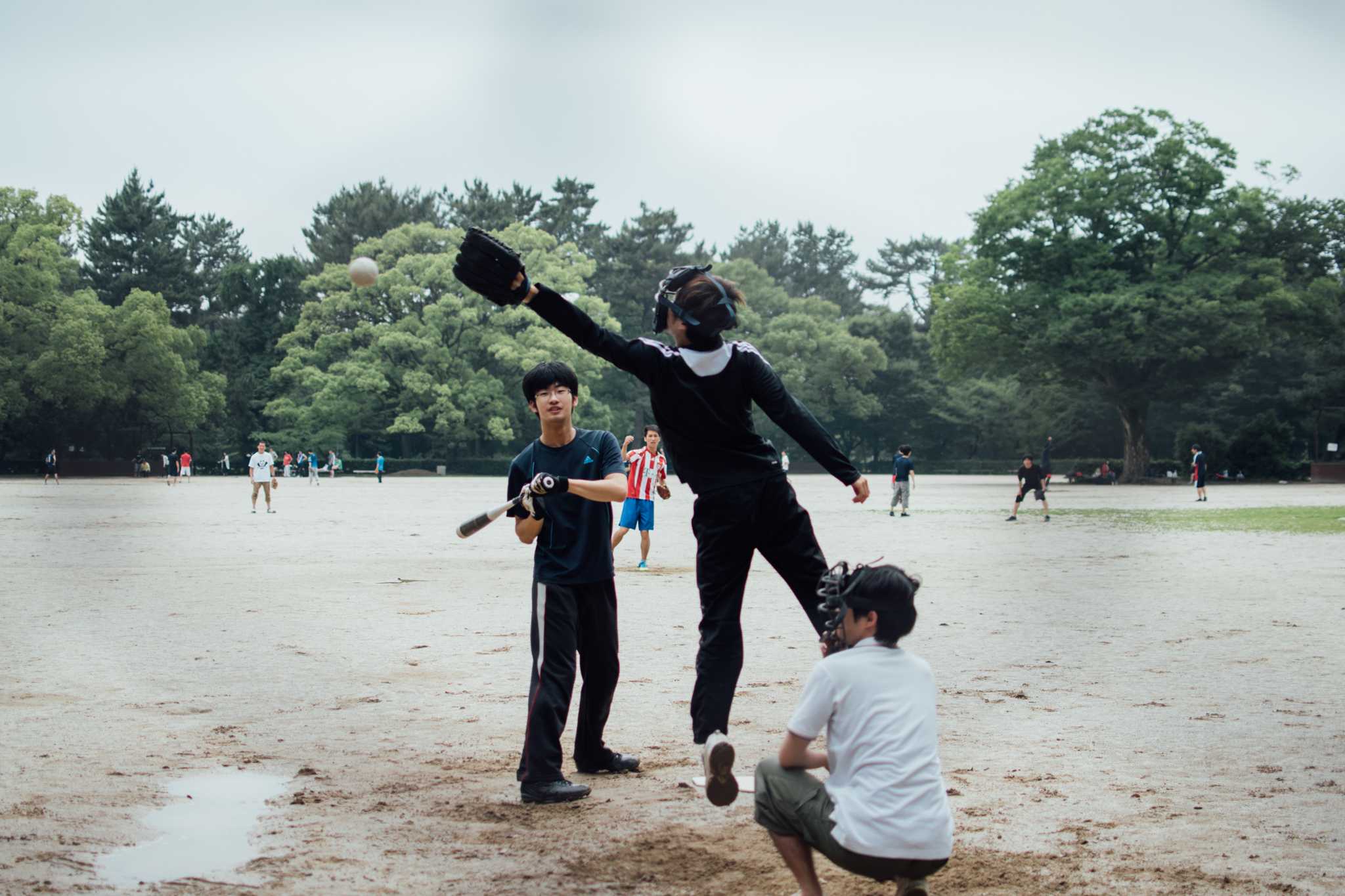
Kyoto, Japan — A boy curls up underneath a slide to play his Nintendo DS.![The ball flies wide in a casual match.]() Kyoto, Japan — The ball flies wide in a casual match.
Kyoto, Japan — The ball flies wide in a casual match.![Code for Palestine students play basketball after classes are done for the day.]() Jericho, West Bank — Code for Palestine students play basketball after classes are done for the day.
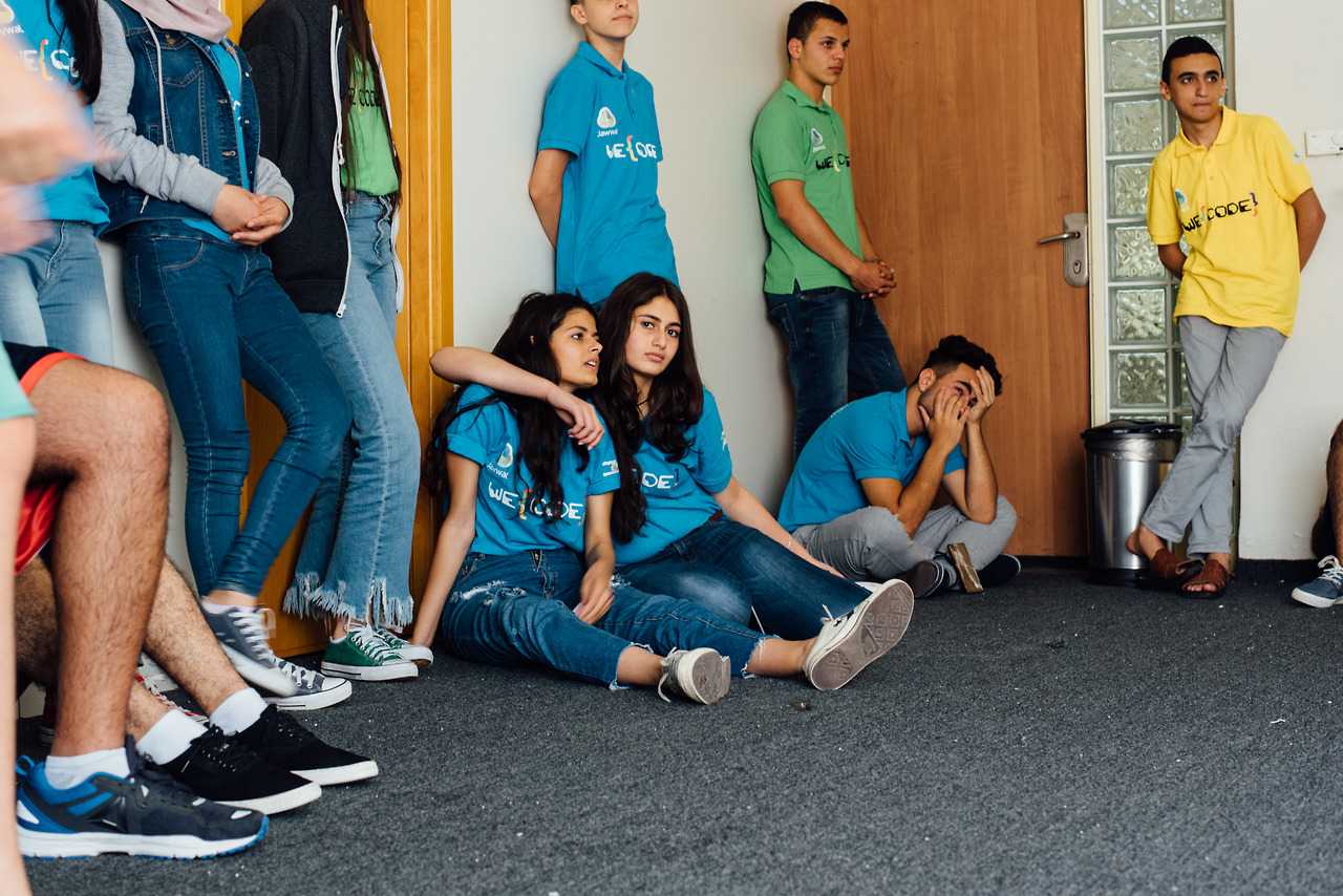
Jericho, West Bank — Code for Palestine students play basketball after classes are done for the day.![Code for Palestine students take design thinking classes in addition to programming.]() Jericho, West Bank — Code for Palestine students take design thinking classes in addition to programming.
Jericho, West Bank — Code for Palestine students take design thinking classes in addition to programming.![Waiting for departure at Narita Airport.]() Chiba, Japan — Waiting for departure at Narita Airport.
Chiba, Japan — Waiting for departure at Narita Airport.![Visiting a batik shop at a local market.]() Medan, Indonesia — Visiting a batik shop at a local market.
Medan, Indonesia — Visiting a batik shop at a local market.![A boy catches and releases turtles at a local creek.]() Kyoto, Japan — A boy catches and releases turtles at a local creek.
Kyoto, Japan — A boy catches and releases turtles at a local creek.![A maple tree in the summer sun.]() Kyoto, Japan — A maple tree in the summer sun.
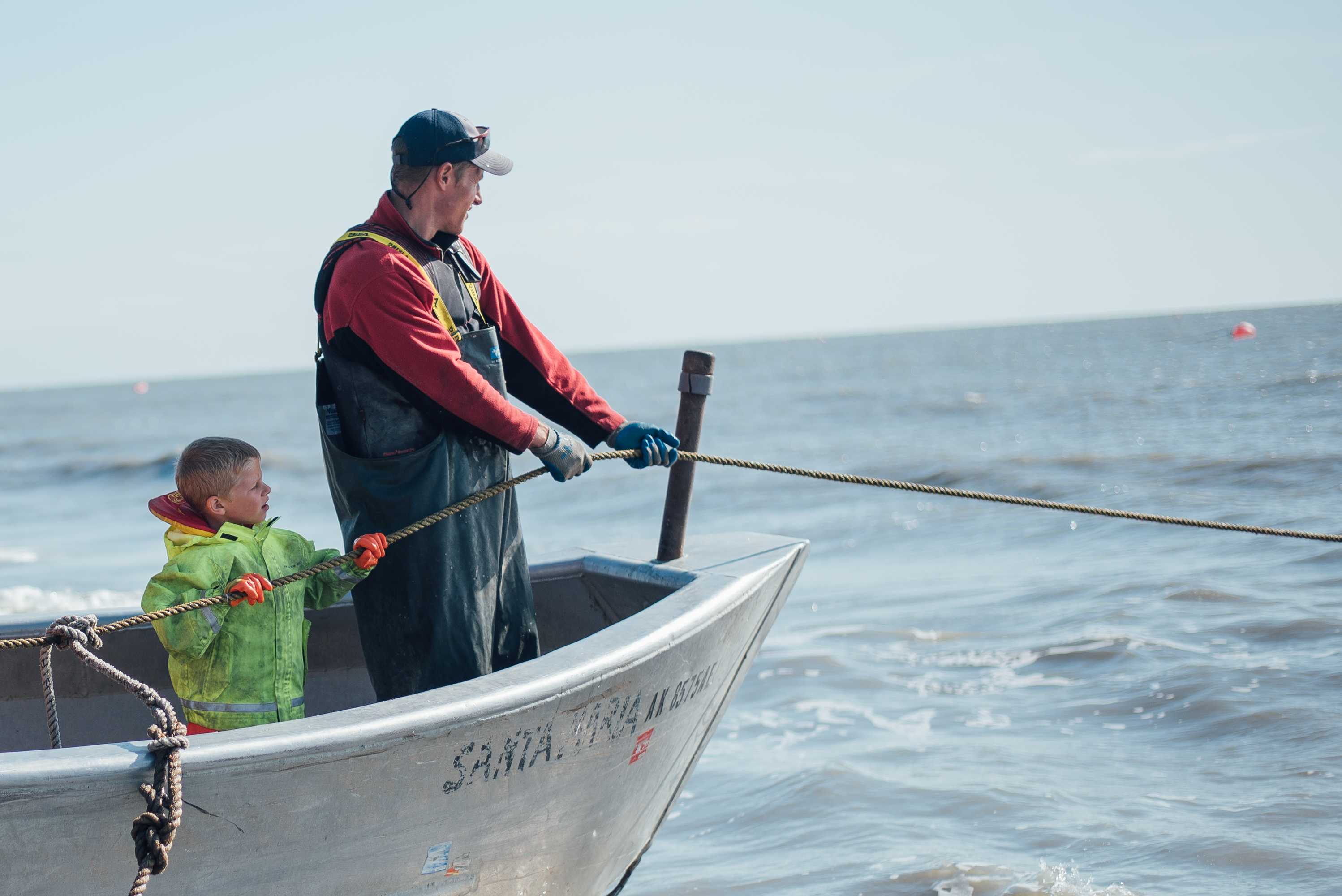
Kyoto, Japan — A maple tree in the summer sun.![A boy and his father prepare to check the nets.]() Cook Inlet, Alaska — A boy and his father prepare to check the nets.
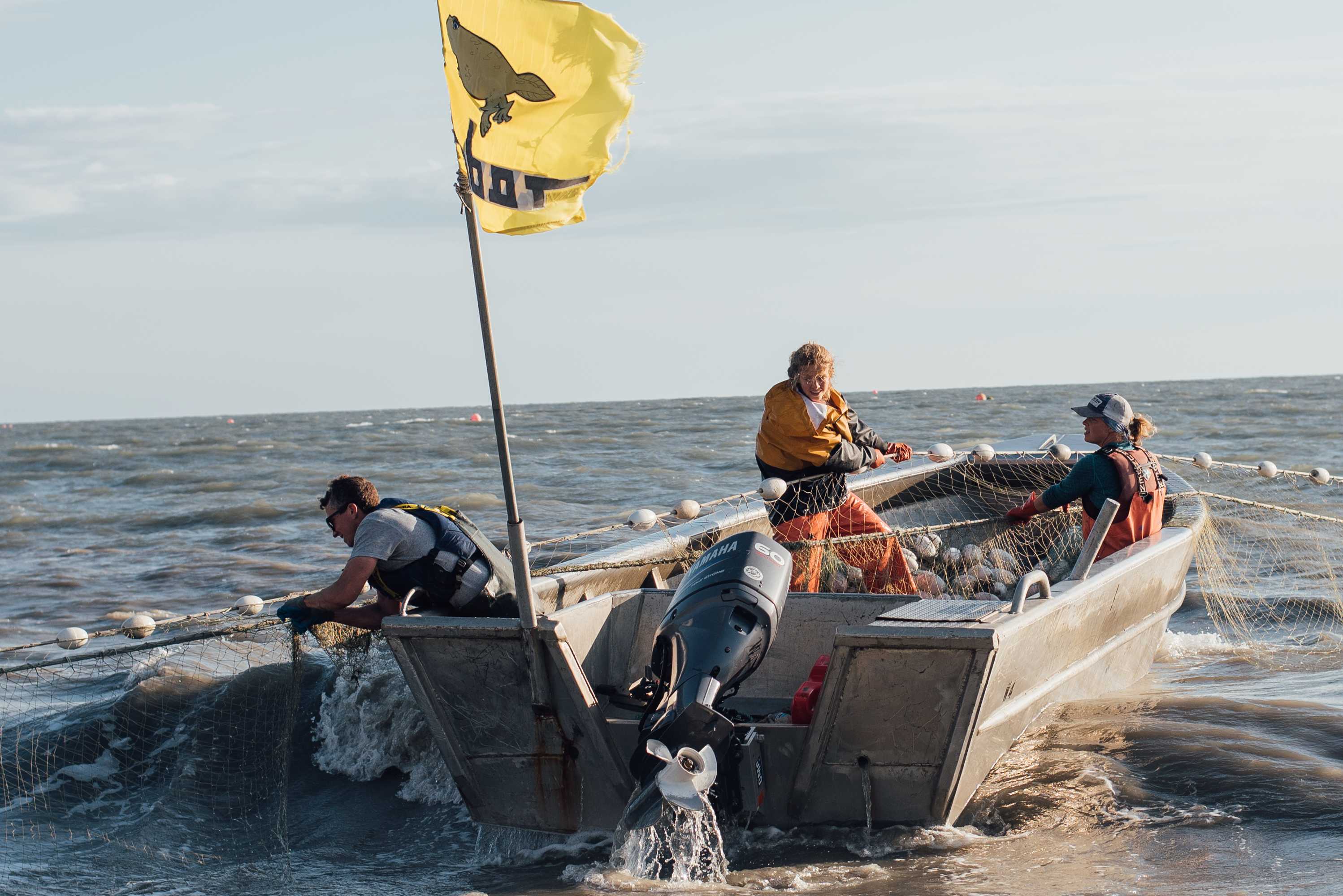
Cook Inlet, Alaska — A boy and his father prepare to check the nets.![Salmon fishermen haul their net.]() Cook Inlet, Alaska — Salmon fishermen haul their net.
Cook Inlet, Alaska — Salmon fishermen haul their net.![A tractor helps out on the fish site.]() Cook Inlet, Alaska — A tractor helps out on the fish site.
Cook Inlet, Alaska — A tractor helps out on the fish site.![Kids play atop an ATV on the banks of a family-run salmon fishing operation.]() Cook Inlet, Alaska — Kids play atop an ATV on the banks of a family-run salmon fishing operation.
Cook Inlet, Alaska — Kids play atop an ATV on the banks of a family-run salmon fishing operation.![Marshall McLaughlin, an intern at a small organic farm in the Capay Valley.]() Rumsey, California — Marshall McLaughlin, an intern at a small organic farm in the Capay Valley.
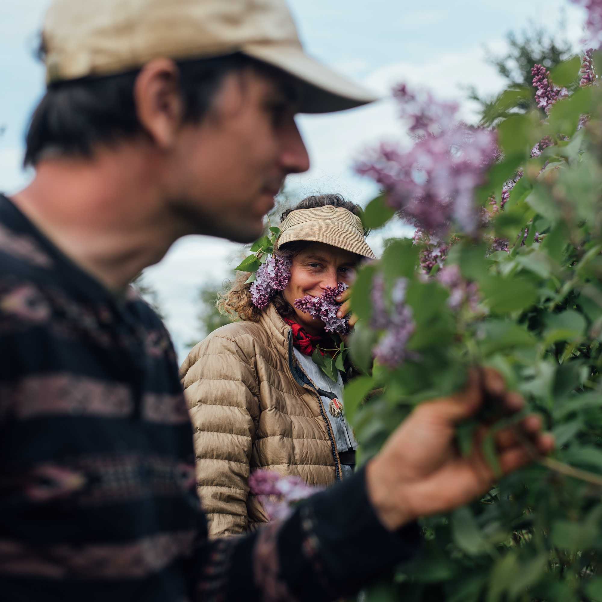
Rumsey, California — Marshall McLaughlin, an intern at a small organic farm in the Capay Valley.![Severine Von Tscharner Fleming of Smithereen Farm stops on her way to her blueberry barrens.]() Pembroke, Maine — Severine Von Tscharner Fleming of Smithereen Farm stops on her way to her blueberry barrens.
Pembroke, Maine — Severine Von Tscharner Fleming of Smithereen Farm stops on her way to her blueberry barrens.![A multi-storied, wooden yurt built by Bill Coperthwaite.]() Machias, Maine — A multi-storied, wooden yurt built by Bill Coperthwaite.
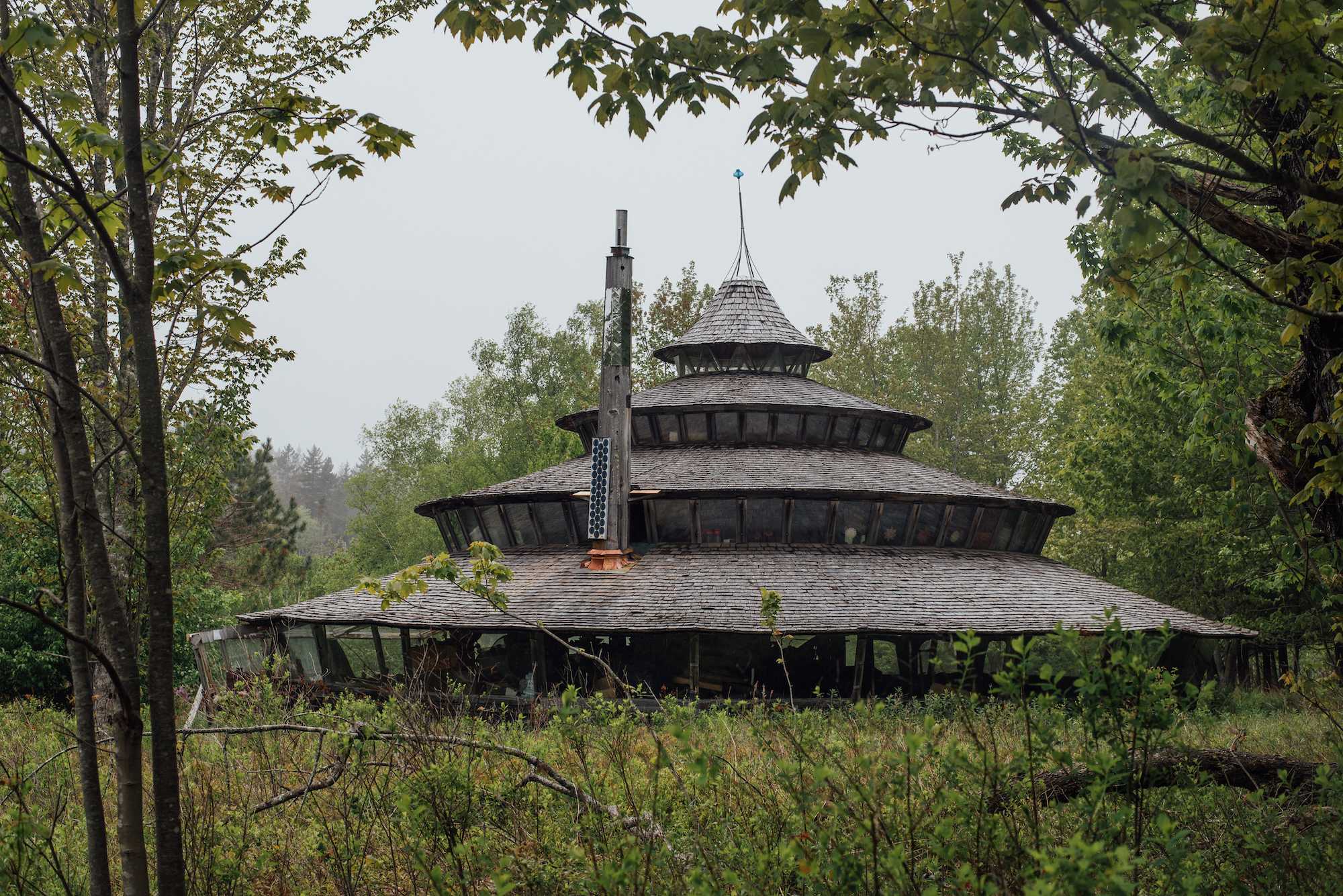
Machias, Maine — A multi-storied, wooden yurt built by Bill Coperthwaite.![Launching a kayak on the Pennamaquan River]() Pembroke, Maine — Launching a kayak on the Pennamaquan River
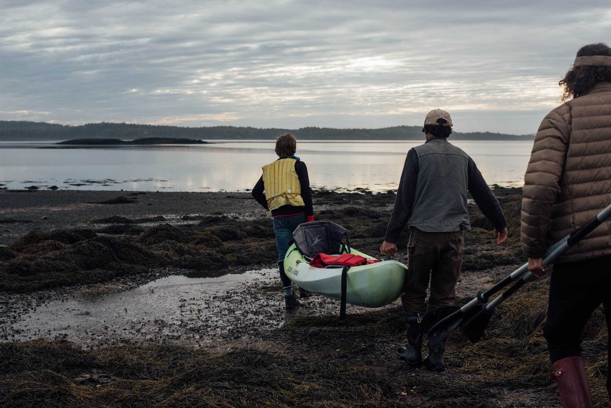
Pembroke, Maine — Launching a kayak on the Pennamaquan River![A high school quarterback asks a friend to deliver a rose during the Homecoming game.]() Palo Alto, California — A high school quarterback asks a friend to deliver a rose during the Homecoming game.
Palo Alto, California — A high school quarterback asks a friend to deliver a rose during the Homecoming game.![A kohai stands in front of a bonfire on the last night of camp.]() Danube Delta, Romania — A kohai stands in front of a bonfire on the last night of camp.
Danube Delta, Romania — A kohai stands in front of a bonfire on the last night of camp.![Looking out over the Cuyama Valley]() Maricopa, California — Looking out over the Cuyama Valley
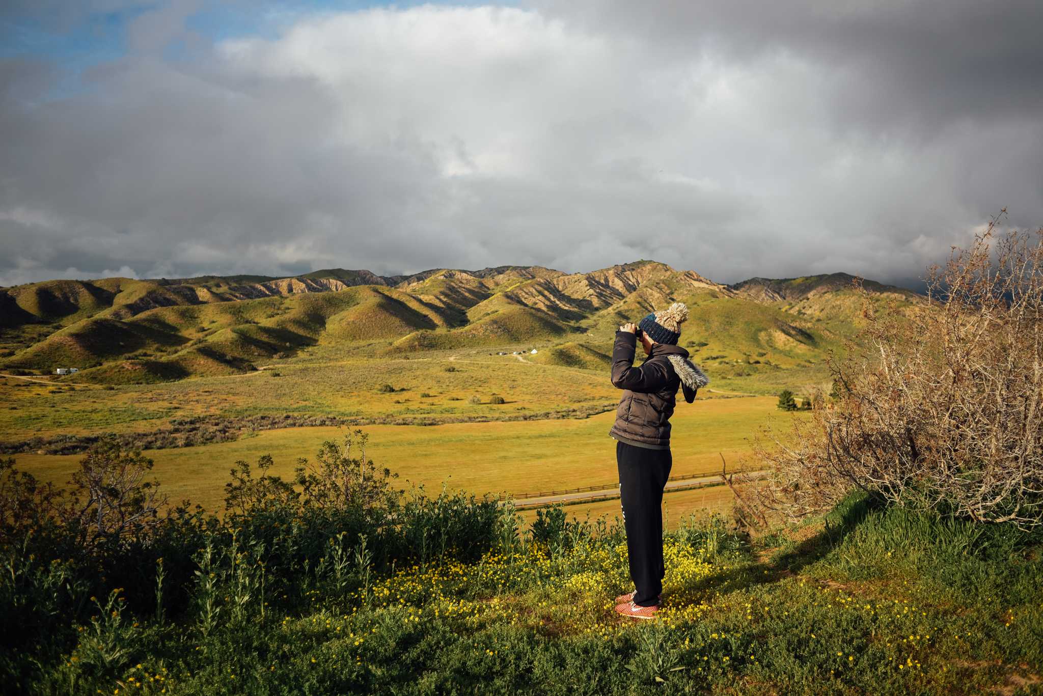
Maricopa, California — Looking out over the Cuyama Valley![The Columbus Park basketball courts are popular with residents in the Chinatown neighborhood.]() Manhattan, New York — The Columbus Park basketball courts are popular with residents in the Chinatown neighborhood.
Manhattan, New York — The Columbus Park basketball courts are popular with residents in the Chinatown neighborhood.![Outside of Lincoln Center]() Manhattan, New York — Outside of Lincoln Center
Manhattan, New York — Outside of Lincoln Center![Two mothers hold their daughters while watching July 4th fireworks over the East River.]() Brooklyn, New York — Two mothers hold their daughters while watching July 4th fireworks over the East River.
Brooklyn, New York — Two mothers hold their daughters while watching July 4th fireworks over the East River.![A young girl holds her dog at a Halloween pet costume festival.]() San Francisco, California — A young girl holds her dog at a Halloween pet costume festival.
San Francisco, California — A young girl holds her dog at a Halloween pet costume festival.
X

San Francisco, California - Danny Pham shares an intimate moment at GAMeBoi SF.
Part of a 2016 series called Coming Home, which highlighted queer Asian Americans and their concepts of home.
Woodworking
 Birch eating set
![Cherry table set]() Cherry table set
Cherry table set![Cherry flatpack low table]() Cherry flatpack low table
Cherry flatpack low table![Small spoon, birch]() Small spoon, birch
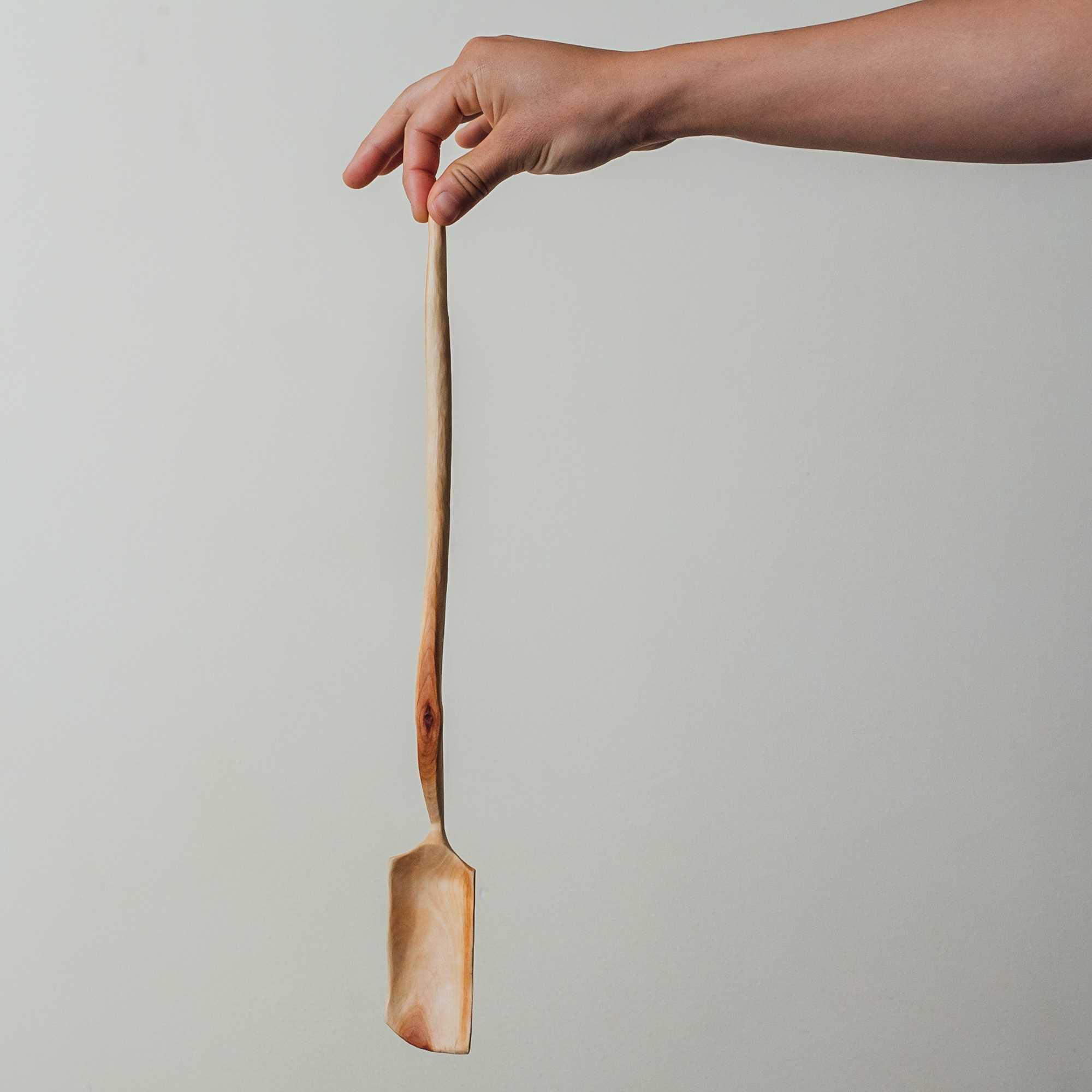
Small spoon, birch![Birch spoon]() Birch spoon
Birch spoon![Cherry spoon]() Cherry spoon
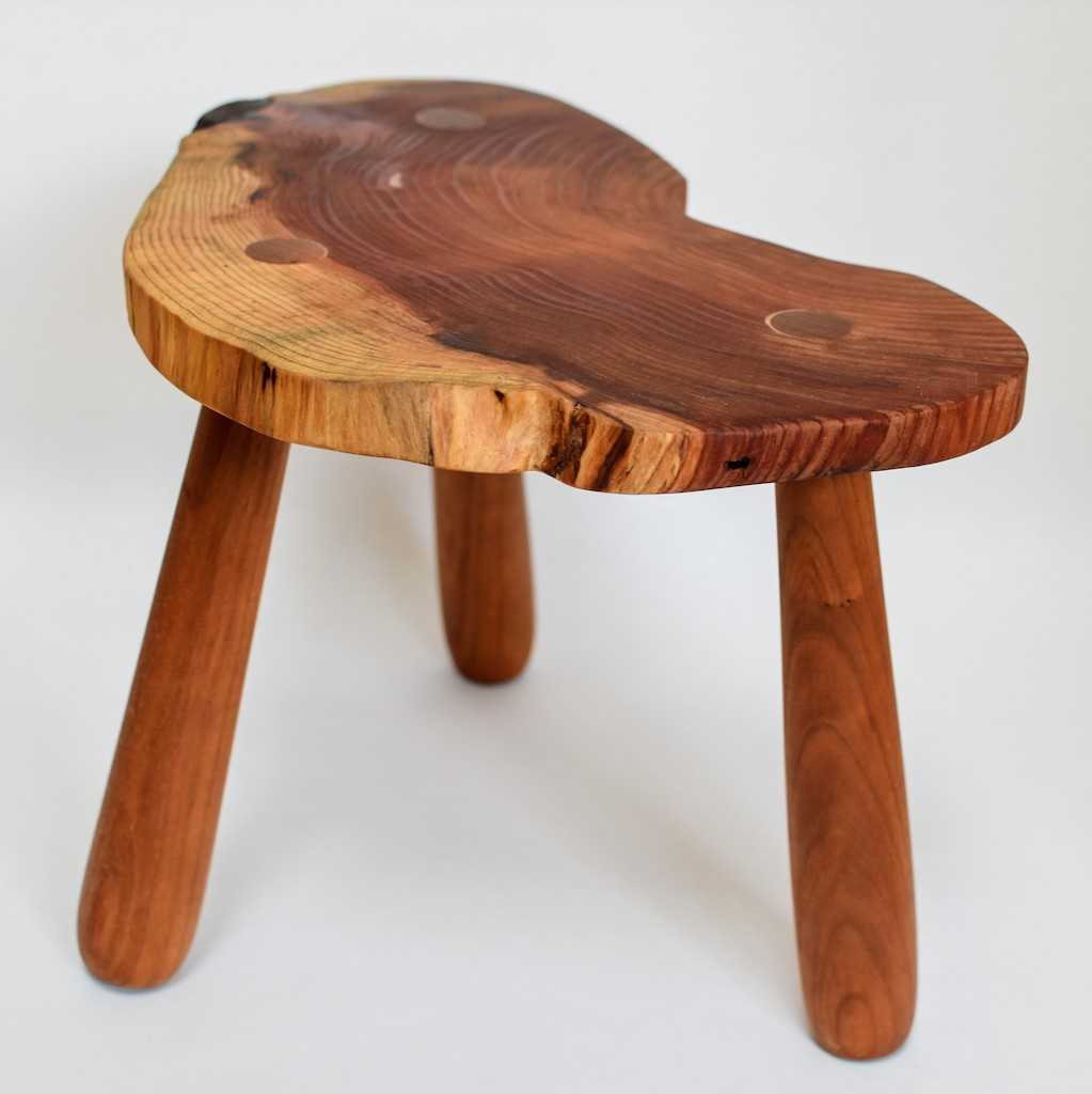
Cherry spoon![Stool, salvaged redwood seat, cherry legs]() Stool, salvaged redwood seat, cherry legs
Stool, salvaged redwood seat, cherry legs![A round stool with a thermochromic leather cushion.]() A round stool with a thermochromic leather cushion.
A round stool with a thermochromic leather cushion.
X

Birch eating set
